
Launched - Zenduty Web v2.0

Last updated
Highlights of the Redesign
- Redesigned UI
- User Friendly (Instinctive)
- UX Improvements
- Faster Load Times
- Superior Schedule Previews
We constantly update the platform to provide the best-in-class experience to our users. These updates are not something that we feel is right for the client; these updates are based on the user data, behavior, and requests that our users provide. We are always excited to bring new updates and share them with people but this one is special!
We bring to you Zenduty Web v2.0!
Redesigned UI
Gone are the dirty grays and dull blues. This new release embraces a major overhaul in the entire design, built from the ground up with our all-new design system and principles. Featuring simple whites and subtle pops of vibrant colors, this new design makes this the most aesthetically pleasing incident management tool ever seen. A dash to Zen in the midst of the chaos, if you will.

Easier Access
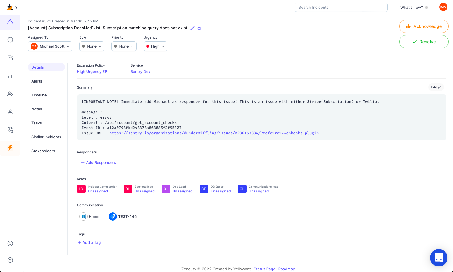
Roles and Responder tabs are so old-school. Just click on an incident. It’s all there. We’ve also gone above and beyond to make more info easier to find. Pro-Tip: Hovering on elements in the new UI can give you superpowers. Go ahead. Try it.

Improved UX
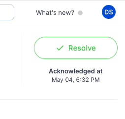
One small step towards animations, one giant leap for the UX. Starting with this release, we’re slowly going to start incorporating more exciting animations and UX enhancements, to give you a more interactive, enhanced experience with Zenduty. You can find an early example of this on our incident details page. More to come in future releases.
Faster Load Times
You know how you hear the ring of an incident and you’re just filled with this instant rush of adrenaline? “What went wrong?” “Where?” “How?” “Show me more!”. Now imagine if you had a really slow website as your SRE companion? The 10 (or more!) second wait time you’d have to sit through while it loads would be absolutely gut-wrenching. You feel it right? Yeah. With this release, everything on Zenduty is just instant. It all loads up in the blink of an eye. Incidents, Teams, Users, Tasks. Almost like it’s always been there, waiting for you.
Better Schedule Previews
If you were to click on a schedule, one of the things that would stand out the most would be the all-new schedule preview at the bottom. The UI has been completely reimagined.
Starting with taking up as much space as it needs, to cleaner more consistent curves and edges, too many more indicative user colors, more comprehensible popup cards to every nook and cranny of the item, we’ve perfected it in design. You’ll also notice that timezones are more obvious now. Takes all of the confusion out while collaborating overseas. Solid quality of life improvements.

So what’s holding you from taking it out for a spin? Sign up now!
04 May 2022

Menahi Shayan
Web & Mobile Engineer by day 🧑🏻💻 IoT tinkerer by night 🛠️
